Temple Coffee Roasters · Web
Shopify Website Development
Problem
Temple's old site was carrying a lot of quiet friction. Every "Add to Cart" click redirected shoppers straight to the cart page, a limitation inherited from a third-party wholesale app that wasn't built for a modern AJAX cart. Information that customers actually wanted was either buried or missing entirely: "menu" was the single most searched term on the site according to Shopify's own analytics, yet there was no page answering it. Coffee classes existed only as social posts the week of, sometimes the day before. The wholesale page didn't make clear what a potential partner could expect, and its inquiry form kicked people off the site entirely to a bare Google Form. On individual coffee product pages, the story behind each coffee, where it came from, how it was processed, was buried in plain paragraph text with no visual hierarchy.
The goal was a full rebuild: fix the underlying technical constraints, answer the questions customers were already asking, and bring the site's presentation up to the same level as the packaging and brand system built around it.
The Cart Problem
The biggest technical constraint was the cart. Temple's wholesale ordering ran through a third-party app that only worked with the old, full-page-redirect cart, so simply switching to a modern AJAX cart would have broken wholesale ordering entirely.
The fix was to split the experience by customer type. Wholesale accounts are tagged and continue to use the original cart, keeping their ordering flow intact. Every other customer now gets a modern slide-out cart that keeps them on the page, surfaces related products, and shows progress toward free shipping as items are added, all coded custom rather than pulled from an app. It's a small distinction technically, one tag, two cart behaviors, but it meant retail customers finally got a modern shopping experience without touching the wholesale infrastructure underneath it.
What Launched
Beyond the cart, the rebuild introduced a full set of new tools and pages, each one answering a specific gap in the old site:
- Bulk Order Form A custom-coded ordering tool for café managers and wholesale clients to order coffee and products faster
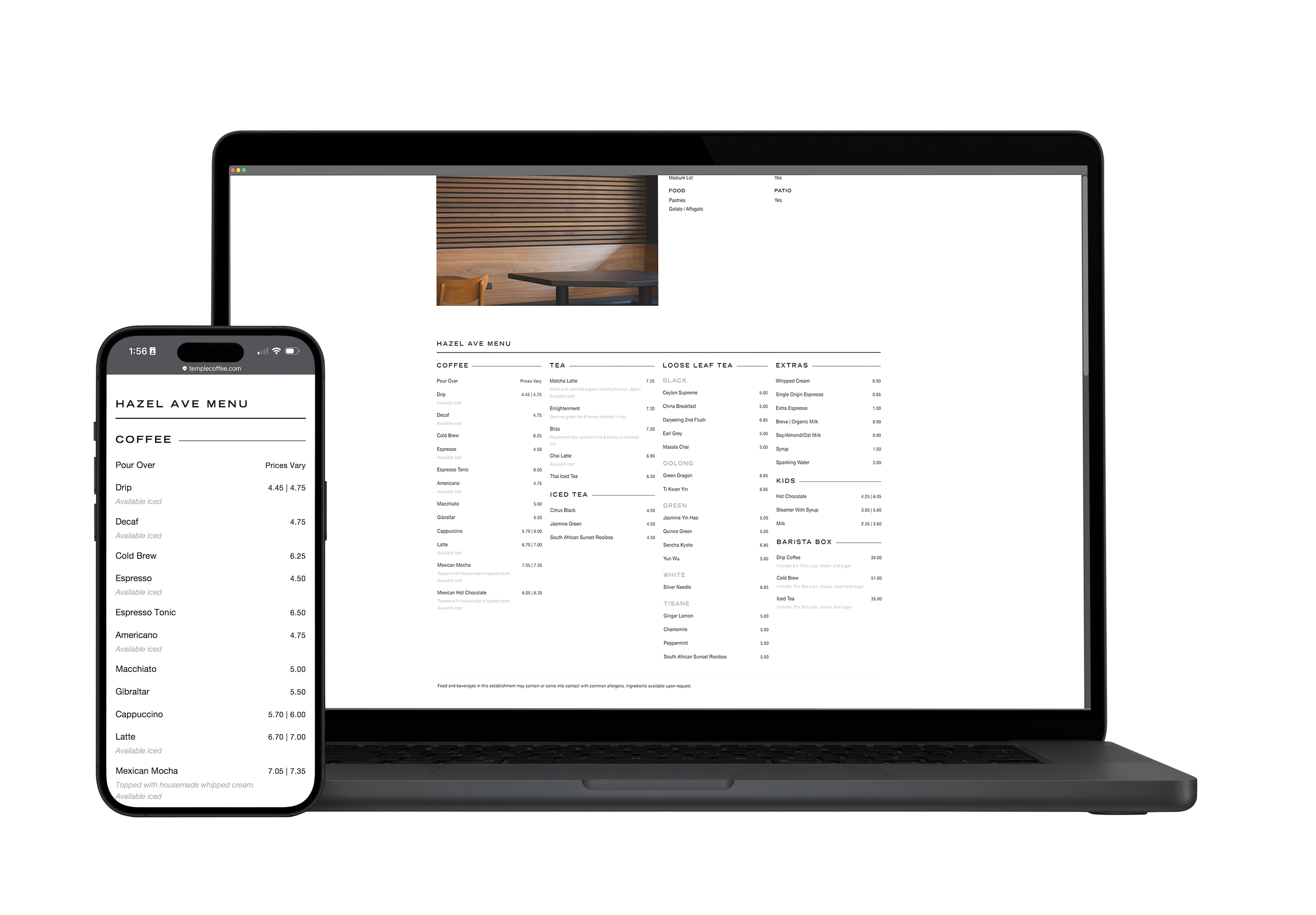
- Café Pages Dedicated pages for all nine Temple locations, each with directions, information, and that café's own menu
- Coffee Classes A dedicated page explaining what the classes are, where, and when, updated monthly, replacing social-only announcements
- Wholesale Page Rebuilt to clearly explain what partners can expect, with a custom inline inquiry form replacing the offsite Google Form
- Filtering Coffee filterable by origin, processing method, and grind size; tea filterable by type
- Accessibility A full alt text audit and pass across product and site imagery
Coffee Page System
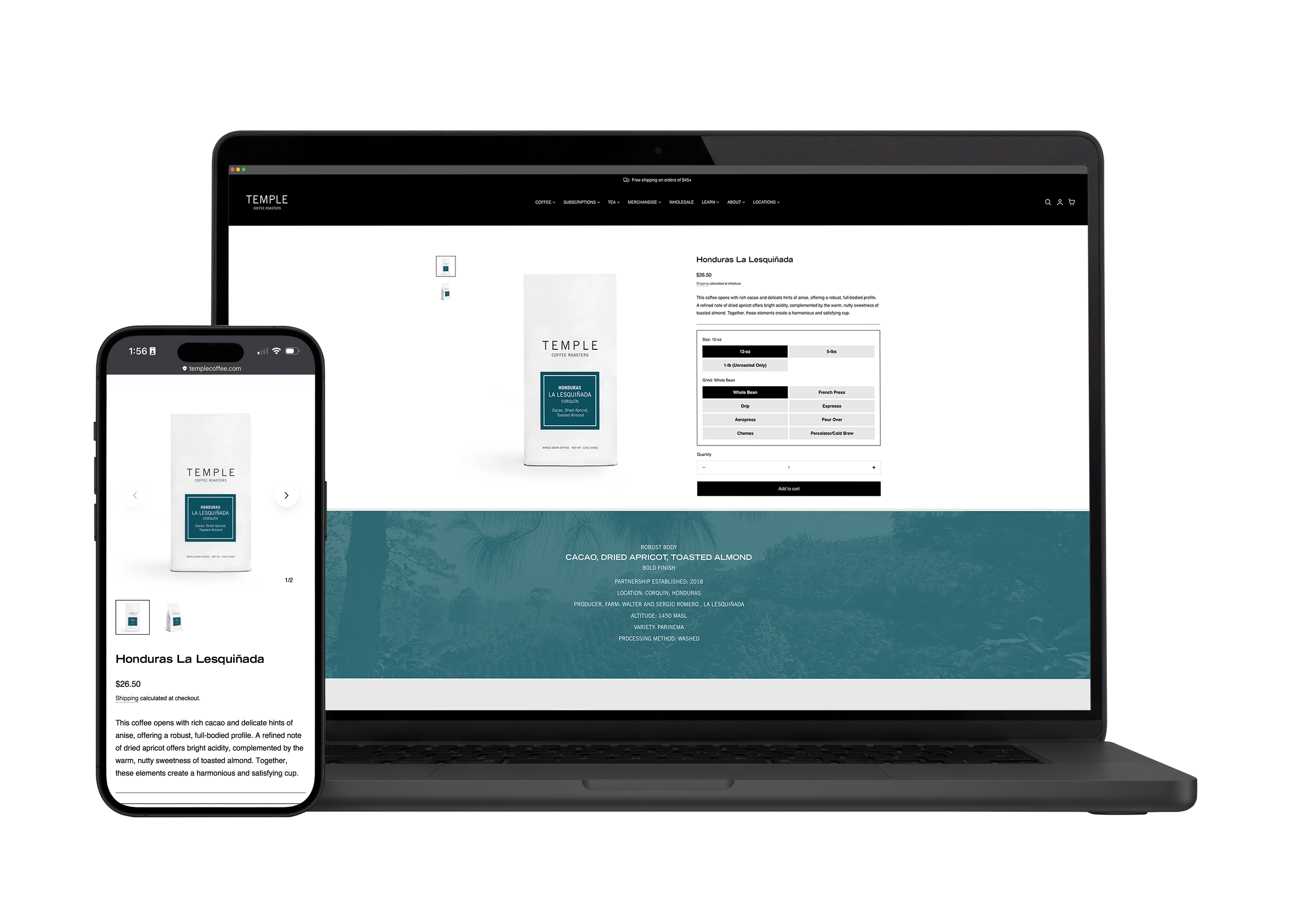
Individual coffee product pages needed the biggest design shift. Previously, everything a customer might want to know, origin, processing, tasting notes, was a wall of plain text. The rebuild introduced a custom section built around a color-overlaid image, with the copy itself restructured around real visual hierarchy instead of a single paragraph.
Both the color and the image are pulled dynamically from a metafield tied to each coffee's origin, using the same region-to-color system already established across Temple's physical packaging (Africa, Central America, South America, Asia-Pacific, India, and so on). That means the website's product pages now reinforce the same visual language customers already recognize from the bag on their shelf, rather than existing as a disconnected system of their own.
Result
The rebuild left Temple with a faster, more modern site that actually answers the questions customers were already asking: what's on the menu at each café, when the next coffee class is, what a wholesale partnership looks like. Product discovery is easier with real filtering, checkout is smoother for retail customers without disrupting wholesale, and the coffee pages now carry the same visual identity as Temple's packaging instead of feeling like a separate system. The result is a site that finally matches the level of care already built into the brand everywhere else.
Gallery
Next project