Temple Coffee Roasters · 2024–2026
Capital Cold Brew: Seasonal Packaging Evolution
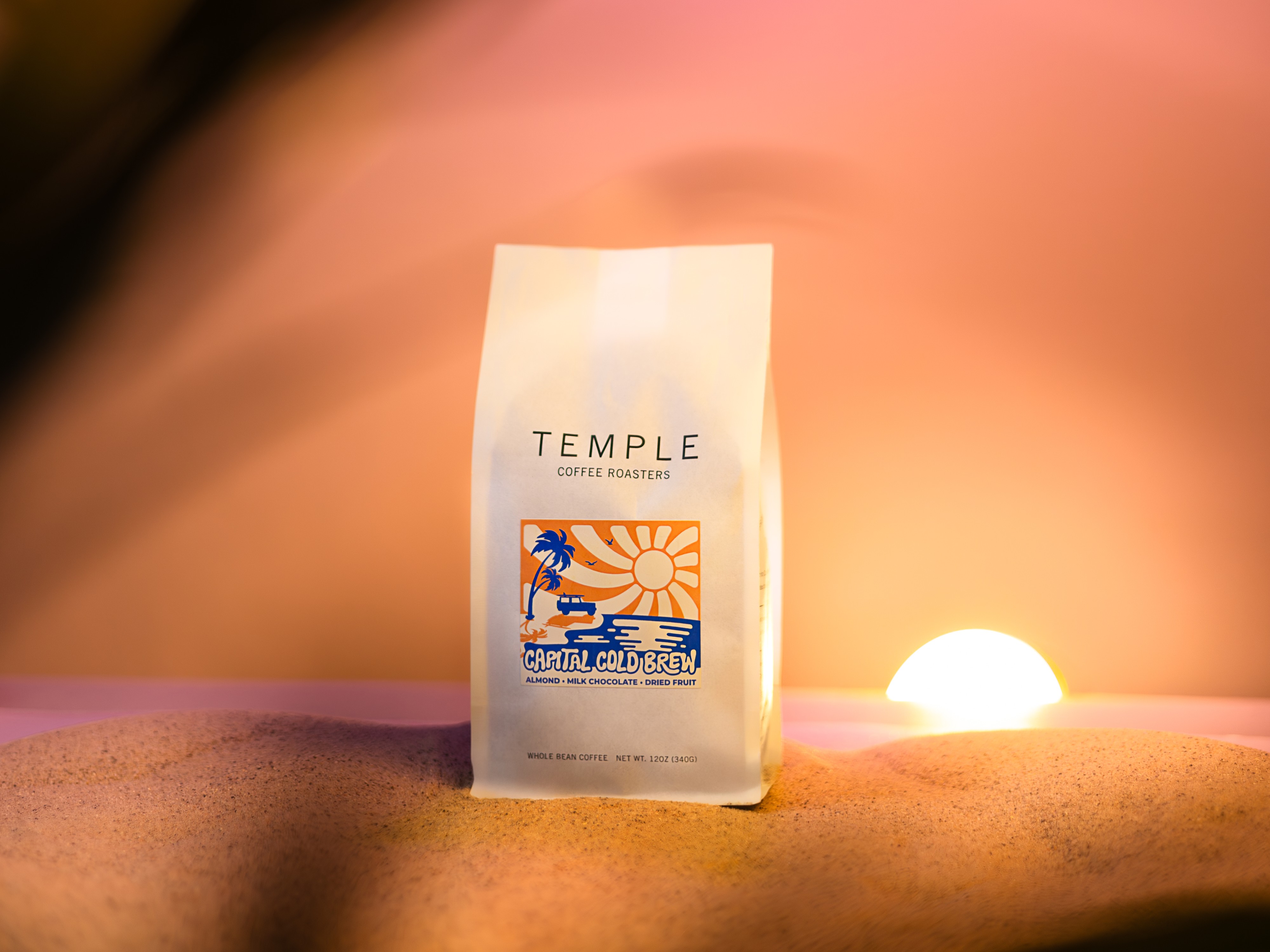
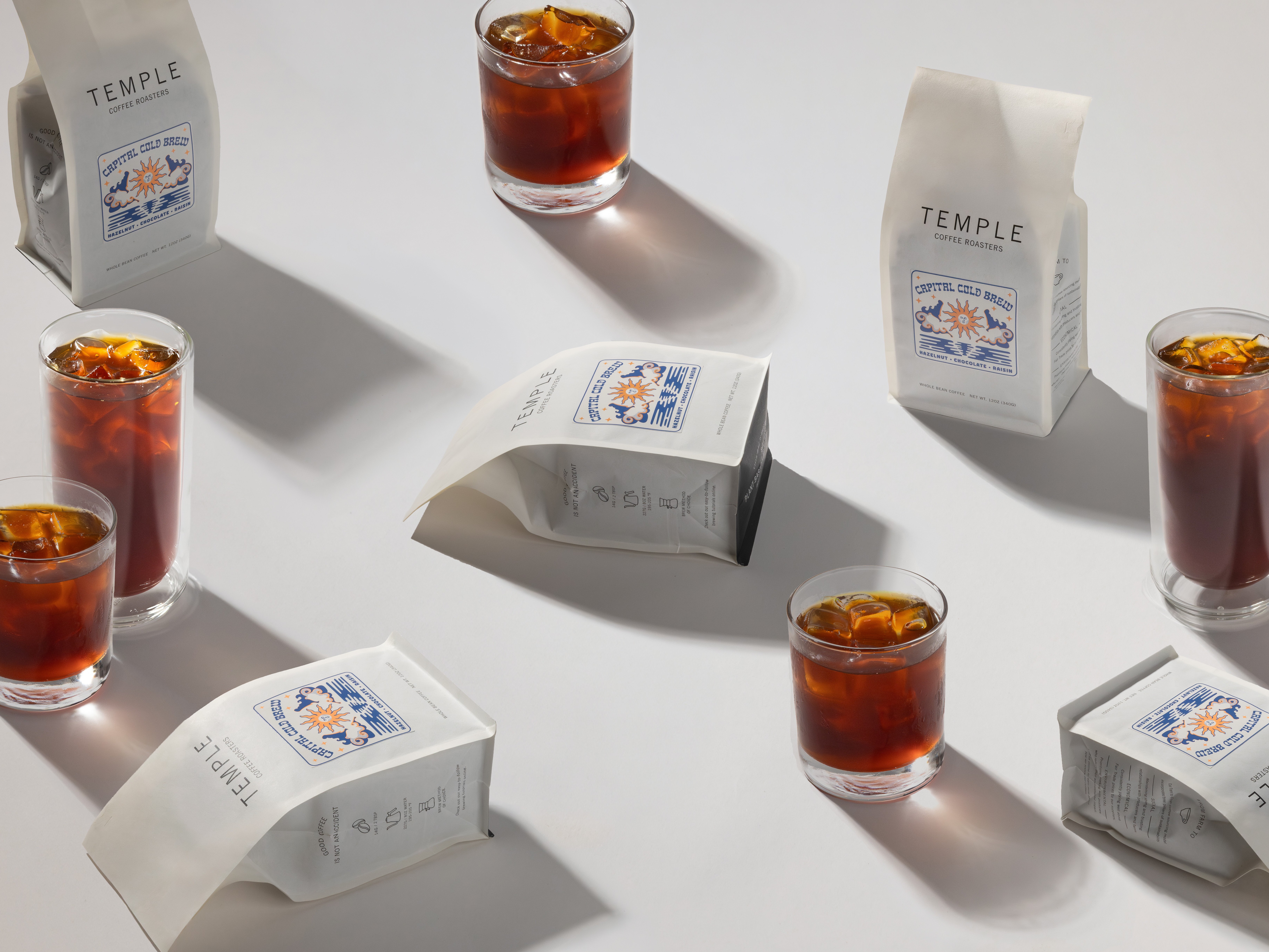
Problem
Capital Cold Brew, or CCB, is Temple's annual summer release: a blend built specifically for brewing cold brew at home. The name plays on Sacramento's identity as California's capital, and California is where the feeling of summer lives most vividly in the popular imagination: sun, waves, surf. The job each year is bottling that feeling and putting it on a coffee bag.
The design challenge starts with format. Temple's retail bag label is small, and translating something as broad as "California summer" into a concept that fits on it, while still feeling distinct from the year before, is the constraint every release has to solve first.
Process
Every release starts with the label. Once that concept is set, everything else builds from it: merchandise, in-café signage, and the direction for that year's product photography, developed together with Temple's creative director and social media manager using the label as our shared reference point.
What stays consistent year to year is the throughline: sun and waves, the visual shorthand that ties CCB back to California summer no matter how the concept evolves. What changes is how literally or abstractly that idea gets rendered.
Constraints
The label is small. Every concept has to read as unmistakably summer at that scale before it extends anywhere else.
Motion
Instagram Story, motion graphics built from the label
Three Years, One System
2024
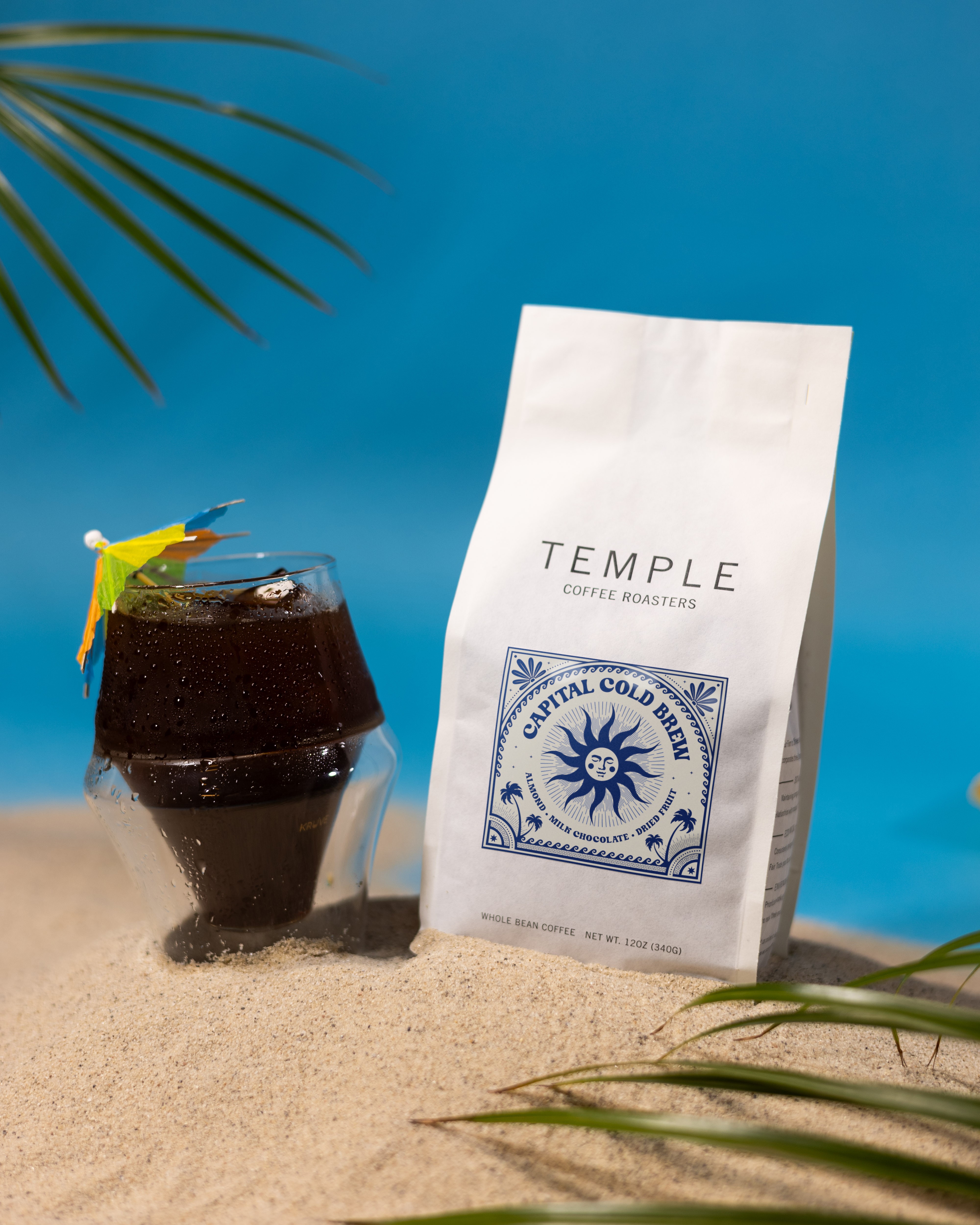
The first label I designed after joining Temple, built around sun and waves as the visual shorthand for a Sacramento take on California summer.
2025
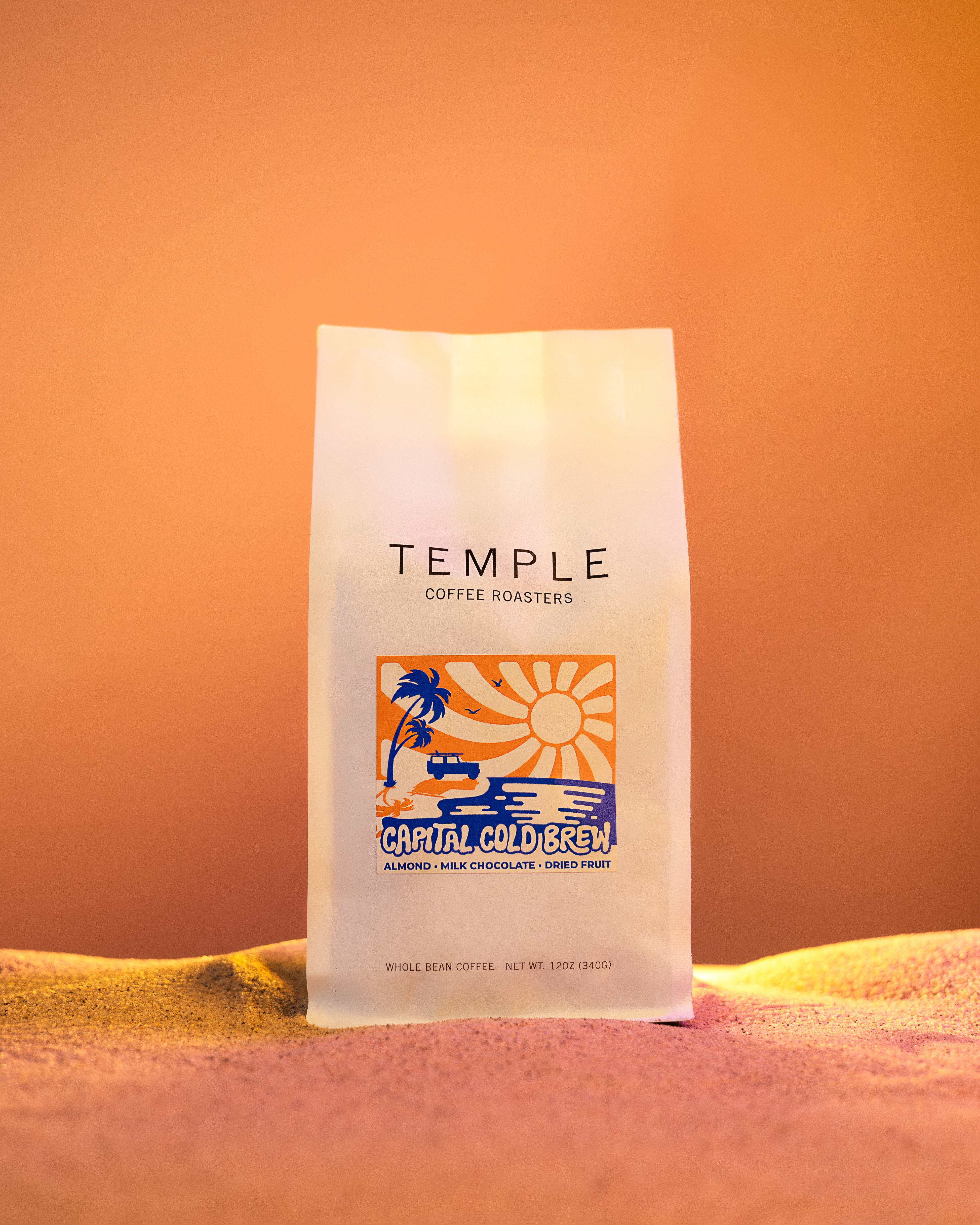
Leaned further into a California surf feel, pushing the sun-and-waves motif toward a more graphic, beach-culture look.
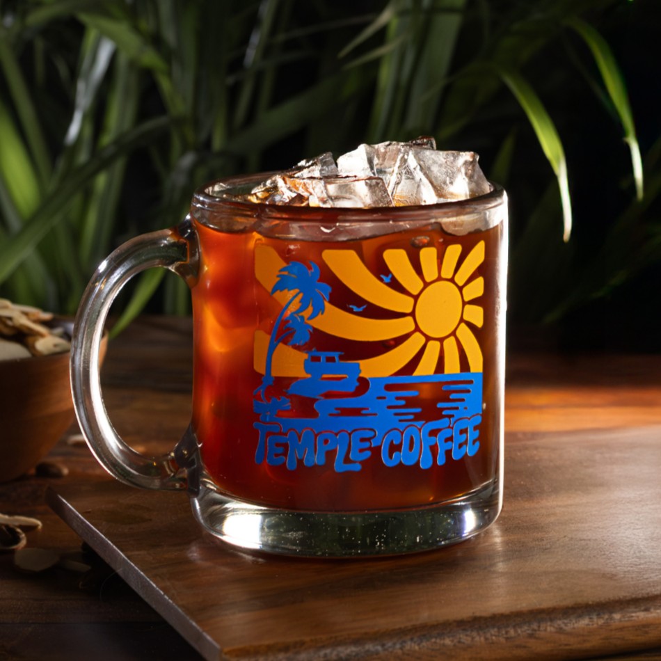
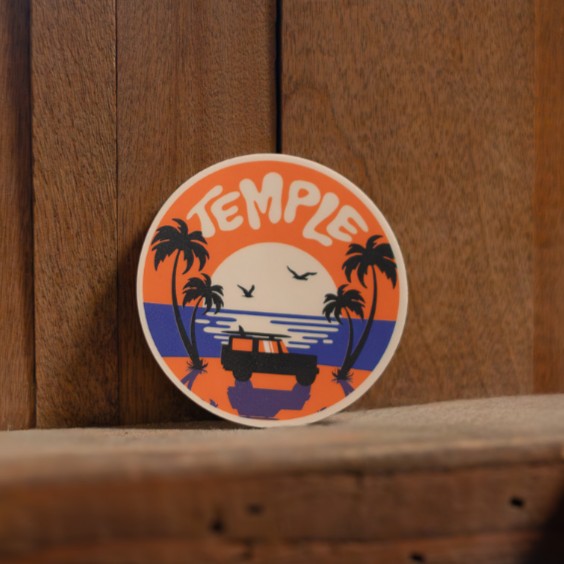
Accompanying merchandise, 2025
2026
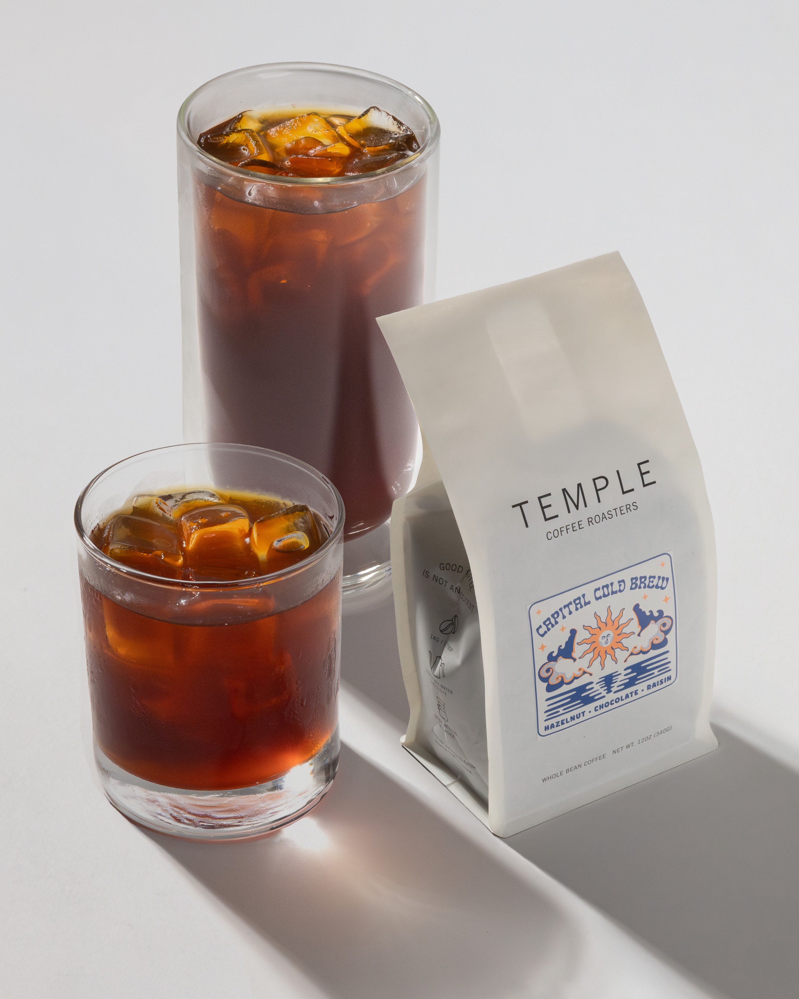
Took on a more mystical feeling, in step with that year's Wonderblend, while keeping sun and waves as the throughline connecting it back to the two releases before it.
Result
Like Wonderblend, CCB is a release customers look forward to each year, especially when it comes with merchandise. The 2025 release paired the label with a glass mug and a sticker, extending the sun-and-waves concept into physical goods people keep using well past the season.
Gallery
Next project